What specs make an image beautiful?
Wanna take a beautiful photo to post it on your Facebook?
or you wanna take a beautiful photo of a product to post it on social media to attract product sales?
Wanna take a photo of a group of tourists to post it on your social media pages of your tour company?
or wanna take a beautiful selfie to post it on instagram?
Here are some unknown simple secrets of a beautiful image taken or created.
color contrast & object sharpness 🔗
The human eye loves the clear parts of the image. And color contrast enhances clearance. Color contrast is the relative difference between colors as you can see in the following image.
 image source : NB for Jewelery | Facebook
What makes this image beautiful is the great contrast of colors which makes the object is clear to the human eye. The object in this image is the jewelery.
similar colors; shades of the same color 🔗
The human eye loves to see shades of color besides each other such as lighty white color background with solid golden colored object. With this specification, the image has great contrast of colors on foreground and background, with some shades of similar colors. That makes image enjoy to see yet sharp and clear.
You can make this kind of effects in image using a light spot of a color similar to the object. for example; shining a golden, yellow or orange lamp on any gold object (a ring).
These specs are found in nature as the sun light shines through trees and their leaves. So, the dominant colors of image are yellow, greenish yellow reaching to solid green. Some golden yellow reaching to brownish yellow. These colors attract the human eye to see and contemplate.

In the previous image, the colors are similar. Almost all of them are blueish colors. Starting from a light blue color reaching to greyish dark blue. Even the white color has a light blue shade, with some reflection of the blue color on the glass. This great similarity in colors doesn’t make it ambiguous image, no, it has good enough contrast of colors for the human eye to see the objects clearly. So, shades of similar colors with good enough contrast makes the image beautiful and loveable.

In the previous image, the beautiful sky blue color and a white color with shades of light blue. This similarity in colors makes the image beautiful with the enough contrast of colors that helps clarity.
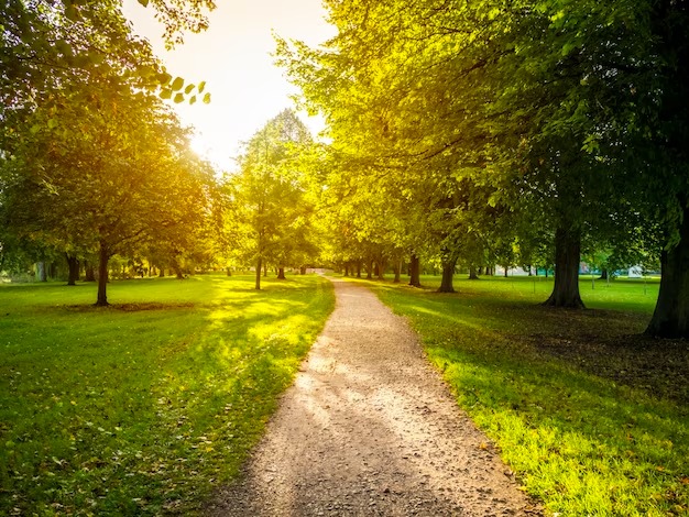
In the previous image, the beautiful nature makes the human eye happy and contemplatey. The reasons of the beauty of this image are too many which includes the grades and shades of yellow, green colors. The yellow color starts from pale yellow in the sky to a golden yellow reaching to a greenish yellow color to light solid green reaching to dark solid green in the shaded/shadow areas.
In addition, there are shades of green starting from light pale yellow to golden yellow to dark yellow reaching to the brownish yellow on land and tree trunk.
This similarity of colors with a good enough contrast between objects are the secrets of beauty.
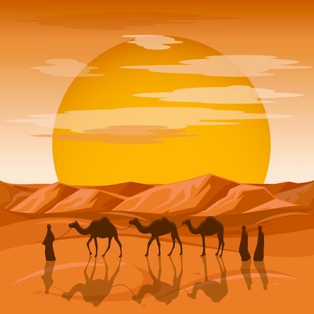
In the previous image, you can see 3 people walking 3 camels through the desert under the shiny sun. The cause of the beauty is that the colors are contrast enough to distinguish between objects and the colors of groups are similar so the brain can group similar colors together to conclude the idea/concept of the image.
You can see the colors of the image ranging from yellow to reddish yellow reaching to brownish yellow. These concepts are some of the secrets of this image’s beauty.
clear object 🔗
The clearer the image’s object, the more beautiful it is. The human eye can understand the image with a glance. The image is beautiful if everything is blurry but the human in the image is sharp and crisp.
The image is also beautiful if the background colors are shades of similar colors (or the same color) and the object has a contrasty color compared with the background colors.
The human brain likes to group similar things into one group or one category, and give it a name. Humans tend to categorize others in a similar and contrasty categories such as “left wing”, “right wing”, “with us”, “against us”, .. etc. The human brain deals with categorized things better and faster as the brain acts to all things in the same category with the same (re)action.
The human brain can save 7±2 entities in the temporary memory at the same time. That means that any human can hold up 5 to 9 things in their short-term memory at the same time. So, using categories and entities makes it easier for the human to hold up to huge information in the short-term memory. For example, holding the name Pi (π) instead of holding all that long number.
Another example, instead of naming each one of the company board like this David – CEO – and Luke – CTO – , … announced this AI-based project., we always say Blah Blah company announced this AI-based project. and this is better as we just categorize the company board as the company itself.
We - people - tend to give a name to each entity to help us think about the whole thing of this entity.
Categorizing things and making them as entities with similar specs help us expressing ourselves better and clearer. Instead of telling too long list of people deciding something, we tell the entity of those people (the group name of them) and focusing on the decision itself. This concept makes the information short and simple and succinct. So, people can understand what you say easier as the cognitive load is less and bearable.
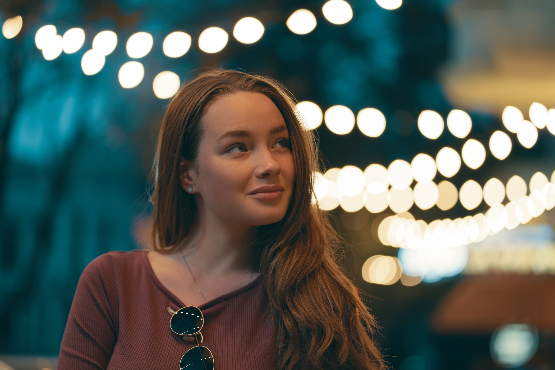 image source : freepik
This is a beautiful image because the girl is isolated from the background with the famous bokeh effect. These specs make the object of the image clearer. The girl is clear and crispy, and the background is blurry and unclear as the bokeh effect is applied.
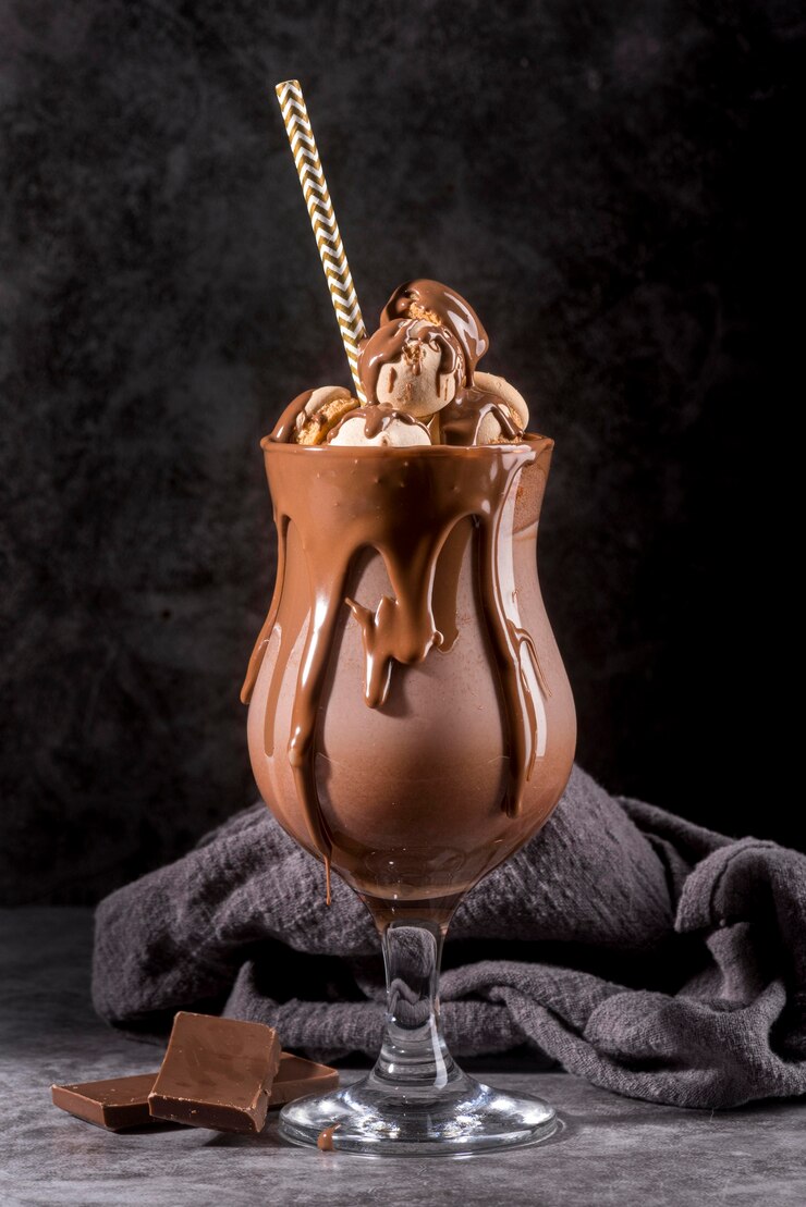 image source : freepik
As you can see in the previous image of a delicious cup of chocolate. The colors of background are three shades of similar colors which makes it easier to categorize them as “background”. So, the colors of cup and its chocolate desert are contrasty and clear on that darkish background. So, the human eye sees the object of the image easier and loves it.
take a photo or create and edit it ? 🔗
You can have a beautiful image by..
- taking a photo as you can see the nature image above or the chocolate cup above
- or by taking a photo then retouch it on some software such as the above image of the girl
- or create the image completely in Photoshop or GIMP.
I hope this post helps you having beautiful images. To see the future posts, follow me on Facebook , X , Telegram , LinkedIn and GitHub .